Table Viewer
The table viewer is one of the fundamental components of SemTUI, it allows users to efficiently visualize a table and perform various kinds of action on it. Before going into the details of each feature, the anatomy of the UI is presented to the reader.
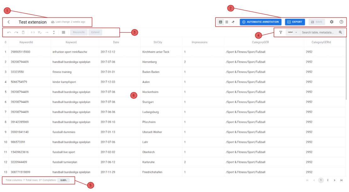
In the above figure the table viewer is shown with each major part highlighted in red. Each region encloses within it, features that are logically related to each other:
1. Header (Table Information)
This section includes the name of the table, which can be changed anytime by the user, and a last modified date visualized in a human readable format. The last modified date gets updated each time an action changes the data of the table, so that the UI can alert the user if there are changes that have not yet been saved. If changes have been made and not yet been saved, there are some UI elements and mechanisms to prevent the user from losing its work. For example, after some changes, if the user tries to navigate between the application pages (e.g. back to the dashboard to select a new table to visualize its data), the user is prompted with a confirmation warning before proceeding.
2. Global Actions (Toolbar)
This section includes actions that can be performed on the whole table, also considered as global actions. They can affect the entire table’s visualization, or trigger events that take into their contexts the whole table. Starting from the left, a Button Group enables a change to the current visualization of the table. Currently a tabular format and a raw format (W3C JSON structure) are available. Future views may include a graph visualization to explore dependencies between table elements and their annotations mapped to a specific KG. The previously analyzed tool TableMiner+ includes this kind of visualization that may be proven useful to less experienced users, giving them a better idea of the obtained results. Additional buttons allow the user to:
- Run a full table automatic annotation process
- Export the table data in one of the available formats
- Save changes to the server
- Open the settings panel, that may affect how some elements of the table are displayed
- Access a tutorial to help guide users through the basics of the tool
3. Contextual Actions (SubToolbar - Part 1)
This group is reserved for contextual actions enabled when one or more table elements (cells, columns, or rows) are selected, and may require specific conditions. Functionalities include: Functionalities include:
- Delete selected column(s): removes the selected column(s) from the table. This action affects only the columns currently selected and can be undone.
- Manage metadata: allows users to view and edit metadata associated with the selected column and cells.
- Refine matching: enables refinement of previous reconciliation matches for selected cells or columns, allowing corrections or adjustments.
- Expand cell: opens a detailed view of the selected cell, showing reconciled data and any additional linked information.
- Expand header: shows the relationships between the reconciled entities of the selected column header, helping users understand connections in the KG.
- View dense or accessible: toggle between dense and accessible view for the selected columns, improving readability depending on the amount of data.
- Modify function: allows users to apply transformation functions to the selected column(s), such as date formatting or text manipulation, updating cell values accordingly.
- Reconcile function: available only if one or more columns are selected
- Extend function: enabled only if one or more selected columns are already reconciled
4. Search, Filtering & Column Visibility (SubToolbar - Part 2)
This section provides advanced search and filtering features. Users can search across labels, metadata names and metadata types The search bar provides suggestions while typing, making it faster to locate specific entities or annotations. Filtering options allow users to focus on specific subsets of data based on their match status:
- Matches: cells that have been successfully reconciled.
- Ambiguous: cells with multiple possible reconciliation candidates, none of which has a perfect score (1), so the correct reconciliation is unclear.
- Miss matches: cells that could not be reconciled or have no match.
Additionally, users can toggle the visibility of columns via a dynamic list, which automatically updates when columns are added or removed, ensuring consistency with the current table structure.
These features help users efficiently navigate large tables, manage column visibility, and quickly identify areas that require attention.
5. Footer (Statistics)
At the bottom-left corner, the footer displays useful statistics about the table: the number of columns and rows, a percentage of annotated table cells, and contextual information when cells are selected.
6. Table Body
The table itself is built with modular sub-components for easy future changes. To efficiently render the table, the TanStack Table library is used, which provides a set of APIs to build lightweight, fast, and extensible tables. Its key feature is its "headless" nature; it doesn't provide any pre-built UI elements, giving developers full control to design their own table UI using performant APIs (like React Hooks). Since tables are a core element of SemTUI, and it's a prototype, it's important to ensure that its architecture is future-proof in terms of development.
7. Column Header Actions
Each column header contains specific actions that allow users to interact with the column in a flexible and contextual way. These features include:
- Pin/unpin column: a column can be pinned to the left to remain fixed while horizontally scrolling.
- Drag & drop column: columns can be freely reordered by dragging their headers.
- Resize column: columns can be resized manually by dragging their edge. A reset button appears automatically to restore all columns to their default width.
- Sorting alphabetical: sorts cell values in ascending or descending alphabetical order.
- Sorting by score match: sorts cells based on the reconciliation score, bringing fully matched entities to the top, followed by ambiguous or unmatched cells.
The column header also indicates the type of data contained in the column:
- Named Entity tag: the cell contains a reconciled entity.
- Literal tag: the cell contains raw text or a literal value.
- Service of reconciliation: cells processed by the reconciliation service will either contain a fully reconciled entity, show a partial annotation if only part of the data could be reconciled, or appear empty if the service is unable to reconcile the cell (e.g., literal values).
Table component
The table component is composed of multiple components so that it can be fully customizable by developers. React Table, on the other hand, provides all API and data structures to build it efficiently.
In the following snippets it is presented the structure of the table component. Each sub component will be imported and used by the main Table component:
📦Table
 ┣ 📂EditableCell
 ┣ 📂NormalCell
 ┣ 📂SelectableHeader
 ┣ 📂SvgContainer
 ┣ 📂Table -> // Main table component
 ┣ 📂TableFooter
 ┣ 📂TableHead
 ┣ 📂TableHeaderCell
 ┣ 📂TableRoot
 ┣ 📂TableRow
 ┣ 📂TableRowCell
 ┗ 📜index.ts