Dashboard components
The dashboard visualizes in a table structure informations for datasets and tables. Each information can be customized to be displayed with a particular component mapped to type data field as explained in the backend section:
export const CELL_COMPONENTS_TYPES: Record<CellComponent, CellComponentProps> = {
  link: {
    component: (row, { value, props }) => {
      ...
      return <MatLink sx={{ textDecoration: 'none' }} component={Link} to={url}>{value}</MatLink>;
    }
  },
  ...
};
The example above renders an information of dataset/table specified as type: 'link' as a clickable url. A custom sort function sortFn can also be specified if the value to order isn't a primitive type.
Example - Adding a new component
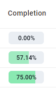
We are going to add a percentage component that shows a progress bar showing the percentage of annotated cells for a table.
- Backend
- Frontend
Add data field completion to COLLECTION_TABLES_MAP of type percentage.
const COLLECTION_TABLES_MAP = {
  nCols: {
    label: 'N. Cols'
  },
  nRows: {
    label: 'N. Rows'
  },
  // we are going to add a percentage component
  completion: {
    label: 'Completion',
    type: 'percentage'
  }
}
Modify the API to return the completion data field for each table.
const DatasetsService = {
  ...,
  findAllTablesByDataset: async (idDataset) => {
    const tables = await ParseService.readJsonFile({
      path: getTablesDbPath(),
      pattern: 'tables.*',
      acc: [],
      transformFn: (item) => {
        // add completion data field
        const { nCells, nCellsReconciliated, ...rest } = item;
        return {
          ...rest,
          completion: {
            total: nCells,
            value: nCellsReconciliated
          }
        }
      },
      condition: (item) => item.idDataset === idDataset
    });
    return {
      // return configuration of data fields
      meta: COLLECTION_TABLES_MAP,
      // return table entities with completion data field
      collection: tables
    }
  },
  ...
}
Let's build a component that renders the progress bar given the completion data field.
Each component receives as input:
- row: row of the dashboard containing each data field for the current object (table/dataset)
- props: contains a value, which is the exact value of a data field, and additional props configured in the backend collection object (see the link data field for an example).
const Percentage = (row, props) => {
  const { total, value } = props.value;
  return (
    <Tooltip
      arrow
      title={(
        <Stack>
          {Object.keys(props).map((key, index) => (
            <span key={index}>
              {`${key}: ${props[key as keyof typeof props]}`}
            </span>
          ))}
        </Stack>
      )}
      placement="left">
      <Stack direction="row" gap="18px">
        <Battery value={(value / total) * 100} />
      </Stack>
    </Tooltip>
  );
}
Add the percentage component type to the list of available component:
export const CELL_COMPONENTS_TYPES: Record<CellComponent, CellComponentProps> = {
  ...,
  link: {
    component: (row, { value, props }) => {
      ...
    }
  },
  percentage: {
    component: Percentage,
    // an additional sorting function can be specified to order the completion object
    sortFn: (
      rowA: any, rowB: any,
      columnId: string,
      desc: boolean
    ) => {
      const { totalA, valueA } = rowA.values[columnId];
      const { totalB, valueB } = rowB.values[columnId];
      return (valueA / totalA) < (totalB / valueB) ? -1 : 1;
    }
  },
  ...
};
The result obtained will be the following: