Metadata components
Similarly to how the dashboard components can be modified and added to display various kinds of information, Metadata components behave in the same way for the visualization of data fields of the metadata of a cell table.
Example - Adding a new component
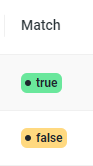
We are goint to add a tag component to show the boolean match data field for each candidate entity retrieved with a reconciliator.
- Backend
- Frontend
Each reconciliator has its own specific configuration. In the index.js file a metaToView property can be specified to map a data field of a returned candidate entity object to a React component, just like the dashboard view.
export default {
  private: {
    endpoint: process.env.ASIA_RECONCILIATION
  },
  public: {
    name: 'ASIA (geonames)',
    prefix: 'geo',
    relativeUrl: '/asia/geonames',
    description: 'Reconcile entities to Geonames using ASIA.',
    uri: 'http://www.geonames.org/',
    metaToView: {
      id: {
        label: 'ID',
      },
      name: {
        label: 'Name',
        type: 'link'
      },
      ...,
      // let's add a new data field called 'match' of type 'tag'
      match: {
        label: 'Match',
        type: 'tag'
      }
    }
  }
}
Let's build a component that renders the tag component given the match data field.
Each component receives as input:
- row: row of the dashboard containing each data field for the current object (table/dataset)
- props: contains a value, which is the exact value of a data field, and additional props configured in the backend collection object (see the link data field for an example).
const Tag = ({ value: inputValue }: Cell<{}>) => {
  const value = inputValue == null ? false : inputValue;

  return (
    <Tag size="medium" status={value ? 'done' : 'doing'}>
      {`${value}`}
    </Tag>
  );
};
Add the tag component type to the list of available component:
export const CELL_COMPONENTS_TYPES = {
  tag: Tag,
  link: ResourceLink,
  subList: Expander
};
The result obtained will be the following: